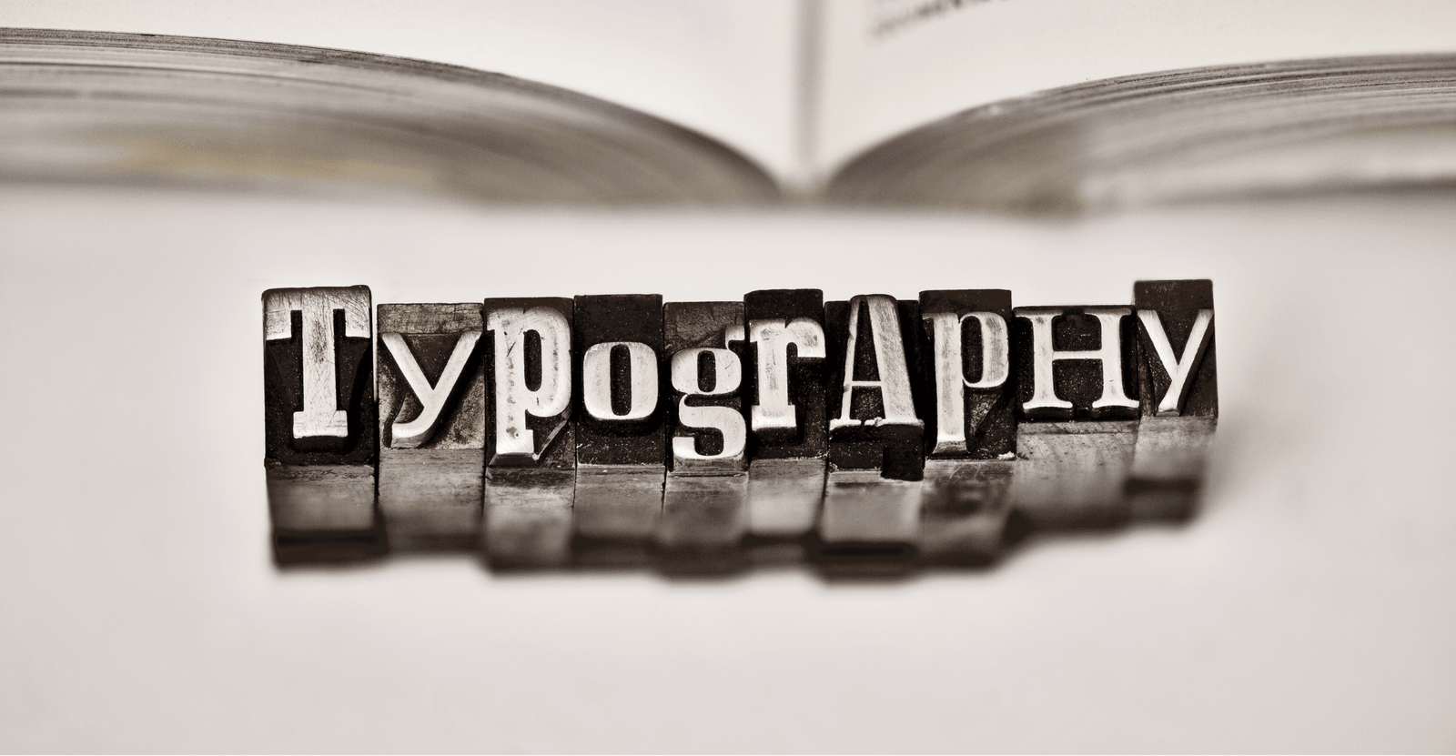
The Most Sought-After Typography Trends in Web Design
By Mitali Purkait Ghosh on March 6, 2024
The website is the mirror of your business’ online presence. Unfortunately, being together with billions of other players online is a slippery slope indeed. A business may have a lot of unique offerings to present but ensure that you are heard that uniquely, your web design needs to exalt.
One of the trends that are all set to make web design exceptional is the integration of typography. By adopting this trend, you will have plenty of options to add an interesting variation to your otherwise lifeless website (that is what it becomes eventually). It is not a very big change but altering the arrangement of letters, changing how they are presented, and also tweaking the style of the web page. A couple of years ago, typography trends experienced a grand success with several creative fonts dominating web designs and the trend will continue in the coming years as well. At Digital Concepts, we bring the highest levels of creative skills to make web designs more intuitive. A team of seasoned designers and WordPress experts for hire have what it takes to enhance engagement. So, you can trust us to boost your web design that delivers exceptional results.
Let’s dive into the most prominent typography trends in web design and learn more from website design and development trends.
1. Bold letters and blaring fonts
The first and the most important typography trend you are to make note of are bold letters and noticeable fonts. With this typography font trend, websites are easier to project and businesses can cut through the noise in the online world effortlessly. Professional designers need to add a splash of contrasting shades in the background to make sure that the boldness attracts the audience. Another reason to create bold letters and boisterous fonts is that your website becomes accessible to several users. It all depends on what the size of the letters needs to be. The arrangements of letters and fonts must encourage your audience to read through and find what’s on offer. Why don’t you hire a dedicated WordPress developer to implement this trend in your website as well and make it look more professional?
2. Three-dimensional effects
With 3D typography trends and best practices, the visual ability of your website takes leaps and bounds besides boosting its volume and depth. Web designers look around for designs and styles to make websites more succinct as well as picturesque. Imagine viewing Mount Everest in a picture. The more the visual appeal the more the visitors throng your website. With immersive experiences like VR and AR taking to the stage more prominently, using 3D typography implies that your website stands out in the crowd. Discuss with a custom WordPress development company for more insights.
3. Animation in typography
If you aren’t yet familiar with the prospect of animation in typography, it’s time to catch up. The world of web designing is not an exception when it comes to using animated typography. Check Google’s Doodles to pour into the ways how animation in typography may create waves. However, the implementation may not be effortless, so you need professional web designers to do things the right way to ensure that content looks appealing and seems exciting to users. Above all, communicate with a WordPress development company in India get more clarity on the outcome of this merge.
4. Handwritten styles
Remember how a few of your friends in school knew how to write in calligraphy fonts? A similar approach is now taking web design by storm, and that’s artistic or hand-lettering styles for websites. All that the designer needs to do is draw the letter format and then style it with a handwritten pattern. A lot of artwork seems to be in the limelight vis-à-vis the latest web design trends.
5. Monospacing
How about making all the website characters of the same width? Choosing a font where characters have a fixed width. Here comes monospaced font that was once used in typewriters and has now entered the web design arena. Such text seems easier to sort and read, making website design focused on accessibility.
6. Including color in typefaces
Gone are the days of black and white and the world of classic typography. However, classicism will blend with modernism in this year’s typographic website design trends but the one difference that’s lurking everywhere is the dash of colors. You must be familiar with the implementation of dark mode in websites. There is no denying the colors truly attract people but when choosing the shades, don’t create a clash. Pick from simple hues that will leave a lasting impression on the users.
7. High-contrast typefaces
If you were thinking of ways to make your texts eye-catchy, this is one of the best solutions! Just think of letters with contrasting colors, or typefaces with significant weight and size differences coming together. Such sharp contrasts create a sense of visual hierarchy, which is sure to grab a lot of attention. So, if you were looking for typography web design examples that leave an impact, and focus on readability, the high-contrast typography style is definitely a great option that you can consider.
8. AI-based typefaces
AI-based typefaces have literally become the game-changer in the landscape of latest typography font trends. Why so? Because designers can use smart algorithms to create fonts according to brand-specific requirements!
Not just that, but AI also suggests the perfect font pairings, fine-tune the spacings, adjust the visual hierarchy for enhanced consistency. Besides that, it can also help create an entirely new and custom typeface in a jiffy. This approach streamlines the overall workflow, and also helps save a lot of time, thereby allowing designers to focus on creative conceptualization, and fast iteration of their ideas.
9. Retro fonts
If you are a fan of the groovy 70s typefaces, and Y2K aesthetics, we have good news for you! The retro fonts have made a vibrant comeback, and are used extensively across packagings, and social media content.
What’s best about these retro fonts is that they evoke a sense of nostalgia, which helps the users to connect to your brand/ campaign instantly. Not just that, but these retro fonts have a feeling of warmth, and when you blend it with contemporary features like interesting color palettes, you can achieve a look that feels fresh, as well as authentic.
10. Minimalist sans serifs
Lastly, if you like to keep texts plain, and simple, the minimalist sans-serif fonts can help retain the highest level of clarity, thereby making the texts readable, and digestible.
Minimalist sans-serifs are best for B2B marketers, as the clean lines, and neutral personalities of the typefaces effectively convey a sense of professionalism. On top of that, designers nowadays are combining these minimalist fonts with subtle animations to make sure that interfaces exude a modern, yet timeless aesthetic. That’s exactly why this particular style is considered as one of the top typography trends in web design, blending effortless readability, with elegant aesthetics.
Check these popular trends that are slated to rule the web design world. The only thing that designers need to keep in mind is that the integration of typography in websites needs to be service-specific. Find out what’s most appropriate for your website during implementation from Digital Concepts, a web development outsourcing company in India of repute. Give us a buzz at +91 98301 40672 to learn more about our expertise in web design and development and to schedule an appointment.

Mitali Purkait Ghosh, the Co-Founder of Digital Concepts, brings a wealth of knowledge and innovation to the marketing sphere. Mitali and her dedicated team offer unparalleled expertise in digital marketing and content writing, among other key online strategies.
Popular Posts
 Top 12 Digital Advertising Platforms to Go for Boosting Brand Awareness in 2024
 - Selling Fragrances Online? Implement These Steps to Make Your Success Smell Irresistible
- 2024 Content Writing Trends: Stay Ahead With These Essential Insights
- Stay In Track With the Best Instagram Trends In 2022
- The Basic of Color Theory and Why You Need to Care for It to Develop Your Website


