The Didot Effect: Why Fashion’s Favourite Font Reigns Supreme
By Mitali Purkait Ghosh on November 10, 2025
Fonts aren’t mere decorations in the visually saturated world of fashion. Here, a single image or a fleeting glimpse of a logo can define an entire brand’s identity. And few elements hold as much subtle power as the font.
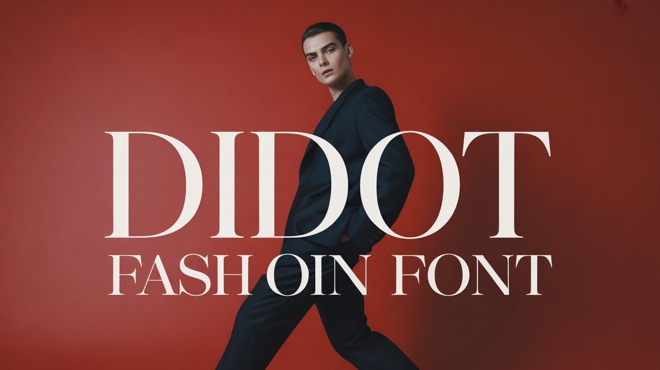
When it comes to supreme elegance, timeless sophistication, and a flair for the dramatic, website design companies in Kolkata, India go for the Didot font.
Didot, standing head and shoulders above the rest, graces the mastheads of countless fashion magazines and luxury advertisements. It isn’t just a font but a statement. Let’s discover how it became a powerful visual signal of aspiration and high culture, and why creative designers still use it.
The Enlightenment Era’s Legacy
To understand the Didot font style’s reign, we must travel back to the late 18th and early 19th centuries in France.
Didot belongs to the family of typefaces known as “modern” or Neoclassical. It was a radical departure from the flowing, calligraphy-inspired styles that preceded it. Created by the legendary Didot family of printers, this font mirrored the era’s push for clarity, order, and rationality.
The Eternally Chic Factor
Many web design development services lean on the Didot font family when working with a fashion brand. And there are good reasons for it!
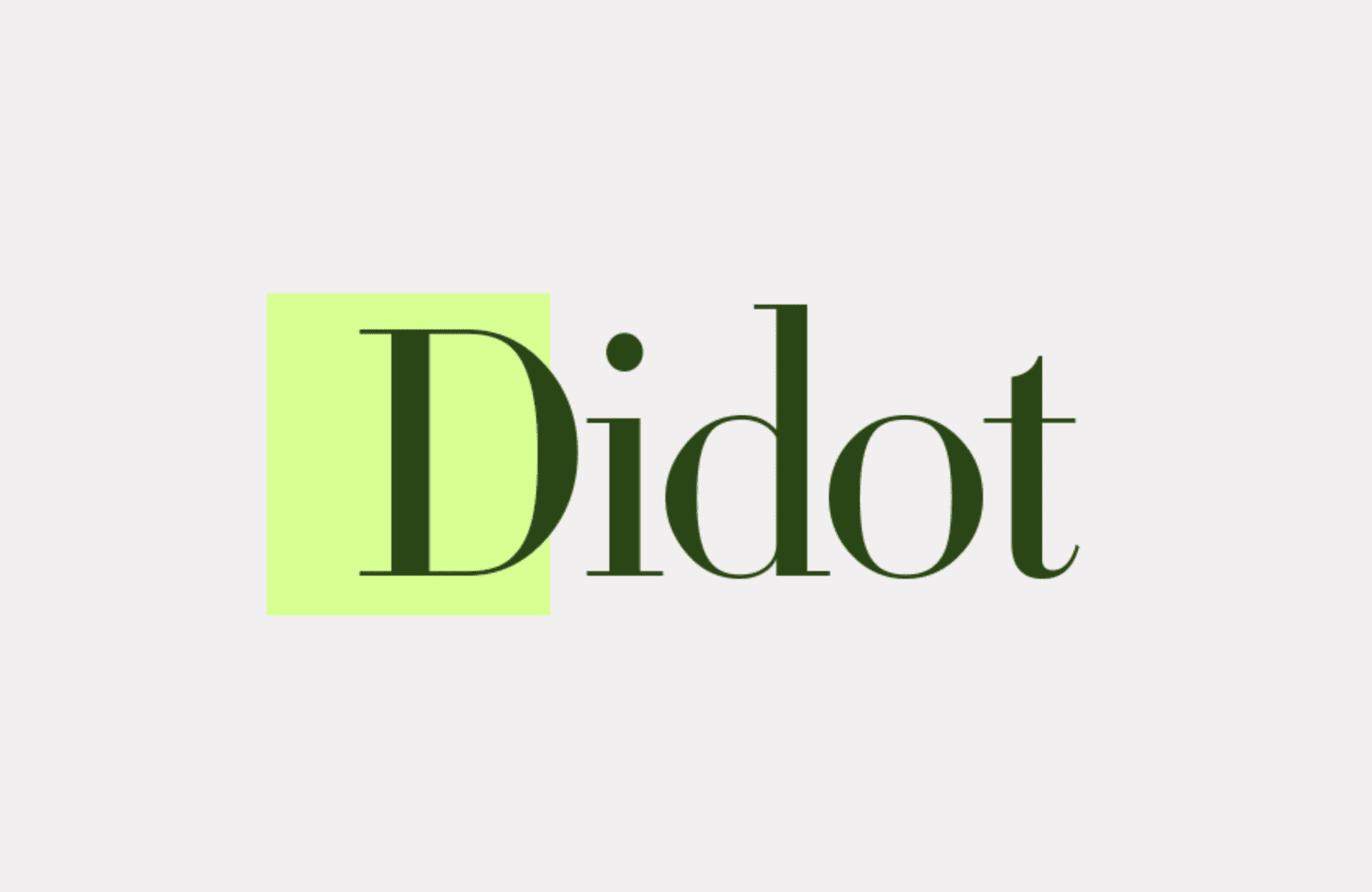
The font is stark, almost architectural. Here’s what makes it so instantly recognizable:
- Extreme contrast: The difference between the thick vertical strokes (stems) and the hair-thin horizontal strokes (serifs) is dazzling. This high contrast creates a tension that is both powerful and delicate.
- Vertical stress: The letters are perfectly upright and vertical, giving them a stately, non-slanted posture.
- Unbracketed serifs: The serifs are straight, thin, and meet the main stroke at a sharp, 90° angle. This contributes to its crisp, modern look.
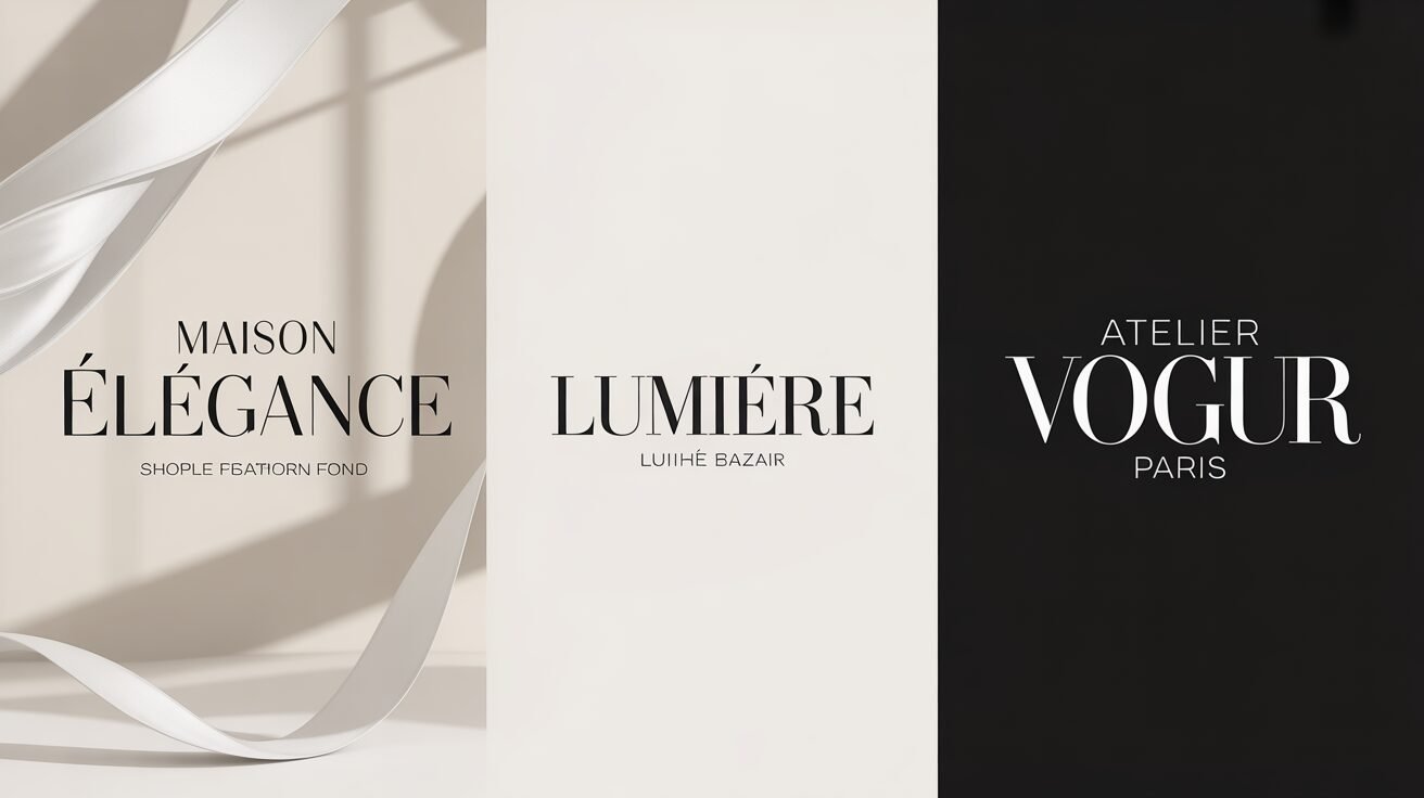
The Fashion Connection

The fashion industry’s intense love affair with Didot isn’t an accident. The font’s inherent characteristics perfectly embody the industry’s core paradox: delicate strength.
Fashion is an art form built on ephemeral beauty—thin fabrics, delicate embroidery, and the often-fragile human form. Didot’s hair-thin strokes beautifully reflect this delicacy. However, the bold, unwavering vertical lines provide strength and gravitas. It whispers elegance but shouts authority. It’s the visual equivalent of a perfectly tailored, sharp-shouldered gown made of the finest, most gossamer silk.
Also, if a WordPress website development agency ever turned Didot into kinetic typography, it would be akin to a Gaurav Gupta piece walking down the runway!
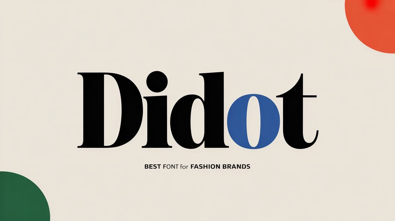
Best Font For Fashion Brands
In an era where digital screens and fleeting trends dominate, Didot remains an anchor of classicism. While newer, geometric, or minimalist sans-serif fonts try to capture the modern eye, Didot offers something deeper. It’s a direct link to the golden age of print and uncompromised aesthetics.
When you see Didot, you don’t just read the word but feel the weight of tradition, the promise of luxury, and the sharp eye of high fashion. The best website developers in India love it for fashion, not only because of its beauty. It’s a clear favorite due to its successful ability to translate the abstract concepts of glamor and prestige into a visually stunning type.
If you’re building a premium fashion brand, you need experts with an eye for elegance and impact. At Digital Concepts, we know the influence a stunning font has. Reach out to us to know more!

Mitali Purkait Ghosh, the Co-Founder of Digital Concepts, brings a wealth of knowledge and innovation to the marketing sphere. Mitali and her dedicated team offer unparalleled expertise in digital marketing and content writing, among other key online strategies.
Popular Posts
 Top 12 Digital Advertising Platforms to Go for Boosting Brand Awareness in 2024
 - Selling Fragrances Online? Implement These Steps to Make Your Success Smell Irresistible
- 2024 Content Writing Trends: Stay Ahead With These Essential Insights
- Stay In Track With the Best Instagram Trends In 2022
- The Hottest Graphic Design Trends for 2025 That You Cannot Afford to Miss


